alert
The alert component has six variants alert-primary, alert-secondary, alert-danger, alert-info, alert-success and alert-warning
standard alerts
avatar
The avatar component has 5 sizes, avatar-xl, avatar-lg, avatar-md, avatar-sm, avatar-xs, having rd,for round avatar, sq,for square avatar,
standard avatars

Badge
The Badge component has 5 sizes, av_badge_lg, av_badge_md, av_badge_sm, having 3 states, online, offline, idle,having rd,for round badge, sq,for square badge,
standard badge
6
Button
The Button component i.e. btn, comes in two catagories, solid buttons and outlined buttons.
solid Buttons
The Solid button is contained with filled colors inside, has five variants btn-primary, btn-cta, btn-danger, btn-link, btn disabled
Outlined Buttons
The Solid button is Outlined, and has five variants out-primary, out-cta, out-danger, out-success, out-info
icon and floating action Button
The floating action button fa-btn and button with an icon btn-icon,
Card
The Card component has three variants, 1. basic Card or vertical card, 2. shopping card or horizontal card and 3. pricing card
basic Cards (vertical card)
The basic Card component has 4 catagories, 1. Cards with badges, 2. Cards with dismiss and 3. Cards with text overlay and 4. text only cards
shopping Cards (horizontal cards)
Card are used to show user related data collectively, like product details.
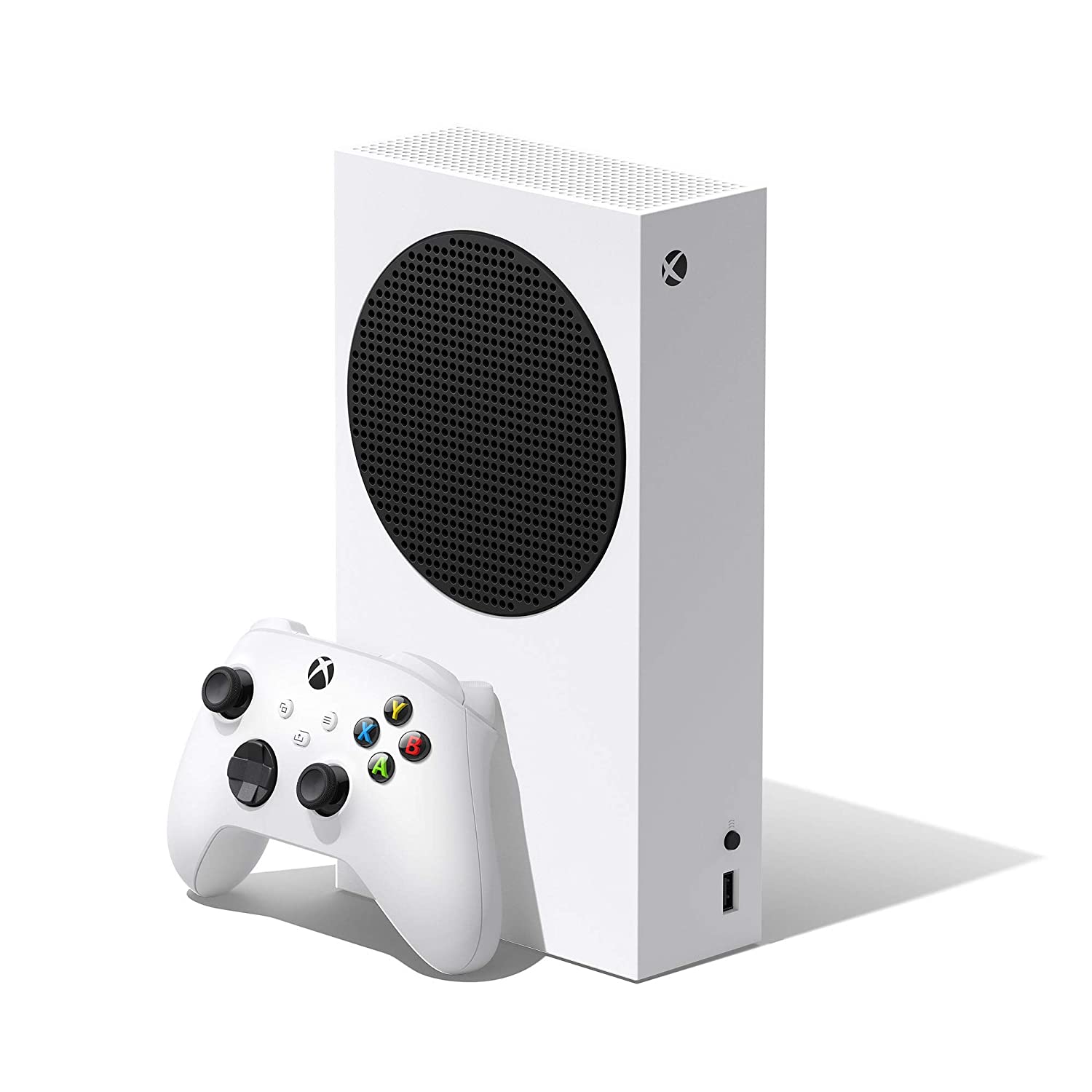
Xbox One Series S
Platform : Xbox One
Go all-digital and enjoy disc-free, next-gen gaming with the smallest Xbox console ever made Xbox game Pass ultimate includes over 100 high-quality games.
pricing Cards
Pricing card is used in subscription plans
- all limited links
- own analytic platform
- chat support
- optimize hashtag
- optimize hashtags
- unlimited users
- all limited links
- own analytic platform
- chat support
- optimize hashtag
- optimize hashtags
- unlimited users
- all limited links
- own analytic platform
- chat support
- optimize hashtag
- optimize hashtags
- unlimited users
Image
Responsive Image
The Image component has two variants img-res, for full size Responsive image.
Round and squared Image
The Image component has four variants img-xl, for extra large image, img_lg, for large image, img_md, for medium image, img_sm, for small image. with round rd and square edges sq.
input
The input component has two variants input sizes and input type
input sizes
inp_lg, inp_md, inp_sm
input large:
input medium:
input small:
input type
The input component has one type i.e. Input error inp_err
input error (inp_err):
Typography
heading
.h1, .h2, .h3, .h4,
This is heading 1.
This is heading 2.
This is heading 3.
This is heading 4.
paragraph - gray text
.p, .p-lg, .p-sm,
This is paragraph large. (p-lg)
This is paragraph. (p)
This is paragraph small. (p-sm)
text center
.text-center,
This is a paragraph in center.
text styles
Text styles are, text line through .text_line_th , text uppercase .text_uc , and text capitalize .text_cl
This is a line through text.
This is a uppercase text.
This is a capitalize text.
Modal
Modals are used to show some important information to the user and they are closed only when the user selects some option.
List
List style
- Item-1
- Item-2
- Item-3
- Item-1
- Item-2
- Item-3
- Item-1
- Item-2
- Item-3
- Item-1
- Item-2
- Item-3
List Category
- Clothing
- Electronics
- Kitchen
- Music
- Posters
- Scuba gear
- Sweatshirts
rating
Rating components can be used as read-only badge or in reviews section. Can be used in reviews section as form too.
Navigation
slider
Allows users to make selections from a range of values.
Toast/Notify/Snackbar
Rating components can be used as read-only badge or in reviews section. Can be used in reviews section as form too.